

The Fusion brand is used across many different audiences. From local churches to international events and ministries, the fusion brand gets stretched for many different needs and functions. The new Fusion branding guidelines define and display how to brand & design for Fusion across the local, national, and international levels.
For individual local churches and youth groups who are creating content for their own Fusion, there is total creative liberty for design and branding. Individual local Fusions can design logos and event/promotional media that meets their individual needs.
Individual Fusions can design for their Fusion only – do not share custom logos & designs across individual teams. Local Fusion logos must contain the unique “name” of the Fusion (for example; Fusion Katowice, Fusion Trinity, etc. It cannot just say “Fusion."
For one-time events, like a Christmas concert or a Fusion tour, there is total creative liberty for design and branding. However, design and media for one-time events should be time-bound (unique to that specific event, not repeating) and should include the full name of the event like, for example, "Fusion Fest Utopia" or "Fusion Olomouc Christmas Concert 2020."
On the local level, it is acceptable to use the national/international Fusion brand for Local media. Go to the Local Brand page for more information.

For country leaders of Fusion ministry and any nationally-run events/projects/materials, use either the country versions or the international versions of the Fusion logo.
Only the national/international versions are acceptable, not custom versions of country and/or international logos.

For the international Fusion ministry, use the international versions of the Fusion logo.
Only the national/international versions are acceptable, not custom versions.


The Local brand is meant to be a blank canvas for individual Fusions to be creative. Logos and graphics made for local Fusions have total creative liberty for their own design and branding. Individual local Fusions can design logos and event/promotional media that meets their individual needs.
Local Fusions can use any design found on the branding guidelines (for example, national/international logos) to start their ministry in a pocket of clean and effective design. It is important to be original with creativity—do not tweak, warp, or distort national or international Fusion logos to create a custom logo for a local Fusion.
Individual Fusions can design for their Fusion only—do not share custom logos and designs across individual teams. Local Fusion logos must contain the unique “name” of the Fusion (for example; "Fusion Katowice", "Fusion Trinity", etc. It cannot just say “Fusion”).
For one-time events, like a Christmas concert or a Fusion tour, there is total creative liberty for design and branding. However, design and media for one-time events should be time-bound (unique to that specific event, not repeating) and should include the full name of the event like, for example, "Fusion Fest Utopia" or "Fusion Olomouc Christmas Concert 2020").


It is possible to get a custom Fusion logo with a local city name. This creates a clean logo that is custom to a city and usable on the Local level. Click the link above and Josiah Venture will create a custom version of the Fusion logo that includes a local city’s name—either in English or in a local language. Do not attempt this on your own.

Provided by Fusion International

The National brand is meant to create a consistent look and feel of Fusion across a country while having localized branding that is recognizable in the region—especially for non-English-speaking audiences. There is unity in this branding along with a country's nationality creating a distinction. There are several versions to provide flexibility with this brand.
For country leaders of Fusion ministry and any nationally-run events/projects/materials, use either the country versions or the international versions of the Fusion logo. If an icon is needed, use the international Fusion “F” icon—do not create custom icons for national use.
These logos cannot be used to create custom versions of country and/or international logos.

COUNTRY LOGO
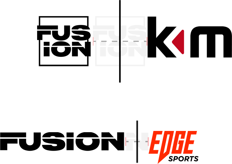
When using Fusion branding alongside country organization branding (KAM, Vital, Fala, etc.), it is important to provide enough space between the two logos. Use visual division, either with a line or a color difference, in order to show distinction and improve legibility. Follow the guidelines shown to the right when designing with Fusion and your country organization.
When designing with two logos, use the Fusion international branding, not the Fusion national branding. Use your country organization’s branding as the identifier of your country. Consult with your national organization when any design should use multiple logos that connect to Josiah Venture or national organizations.

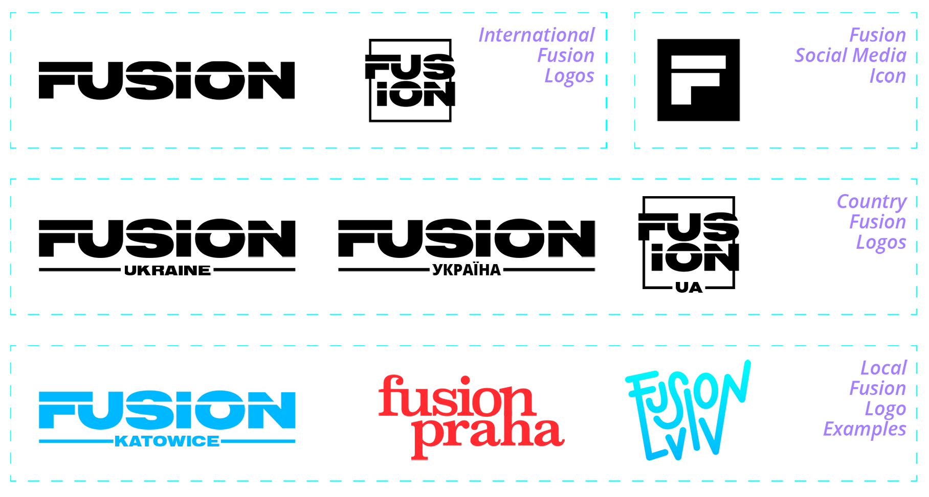
The International Fusion brand is built for unity across all countries, local churches, media, and platforms, with strong typography and effective composition. This branding can be used for many things in its simplest form and can also be used for far stretches of creativity. This branding will be used anywhere there are international Fusion audiences, or connecting Fusion ministries with outside/sending countries.
This branding can be used at the local level by itself. This branding cannot be used as part of a custom design.

A core value of Fusion is expressing creativity. With this brand, it is encouraged to use the logo and branding guidelines creatively to fit each particular need of branding, whether local, national, or international. Along with creativity, it is important to understand the fundamentals of the brand—how to maintain integrity with the new Fusion look & feel.
These guidelines apply in any instance of using the international/country forms of the logo. Local Fusions are free to create their own logo if they would like to, or they can use the international/country version. See the National Brand page for more information.
This identity can be used in many ways—different colors, layouts, and styles work well with this logo. However, in order to maintain visual integrity, there are ways of using the logo that is not acceptable:
- You can use photos inside the logos and letterforms.

- You can put any colors, shapes, and gradients behind the logo, filled, or outlined.

- You can change the colors and patterns of the logo. Note that any change or effect on the design is consistent throughout the whole logo.

- Do not stretch, compress, warp, or skew the logo in any way.

- Do not split the design within the logo (No half-and-half color or design choices).

- Do not add a custom outline to the filled logo. Use the logo as filled ONLY or outlined ONLY.

- Do not change the font of the logo or make it look like the Josiah Venture logo.

- Do not change the layout of the logo (no moving individual letters, changing angles, etc.)

- Do not “hand-make” or design a custom logo at the national or international level.

- Do not use any previous Fusion logos for the national or international level.

- Do not create or use a custom icon to put next to the word Fusion, whether or not it is a logo.


The international Fusion brand is what is used on top organizational level communication. Standards set with this brand apply to countries as well. Country Fusion teams either use the international brand or the country-specific brand for Fusion—the country level of Fusion must maintain the integrity of the Fusion brand overall.
The “F” icon has been created for social media and website icon use ONLY—places where the design space is too small to be read. This icon should not be used on other designs, as it does not indicate fusion by itself.
For the local Fusion brand, individual teams are able to create logos and graphics for their own Fusion groups. The only guideline is that local Fusions need the name of their distinct Fusion to be part of the design (“Fusion Trojka,” “Fusion Katowice,” etc.) in order to create their own logo & graphics.

The main typography and the header typography are set in Termina Black. We use this font, filled or thinly outlined, in all caps. This font is not for use in lowercase.
The body typography, for things like long articles or big chunks of writing, is set in Open Sans. This should be the default in any computer, or easily found online. Also included in the larger font—Open Sans Light, Regular, Semibold, and Bold, including Italics.
Local and national branding: On the national and local levels, it is not essential to use these fonts. These are just our recommendations for a clean, professional look. Most sans-serif fonts work effectively with the Fusion look & feel.
termina black in all caps.
Headline
Open sans Regular is the body font. Lorem Ipsum is simply dummy text of the printing and typesetting industry. Lorem Ipsum has been the industry's standard dummy text ever since the 1500s, when an unknown printer took a galley of type and scrambled it to make a type specimen book.
Body
USE TERMINA BLACK IN ALL CAPS.
Paragraph

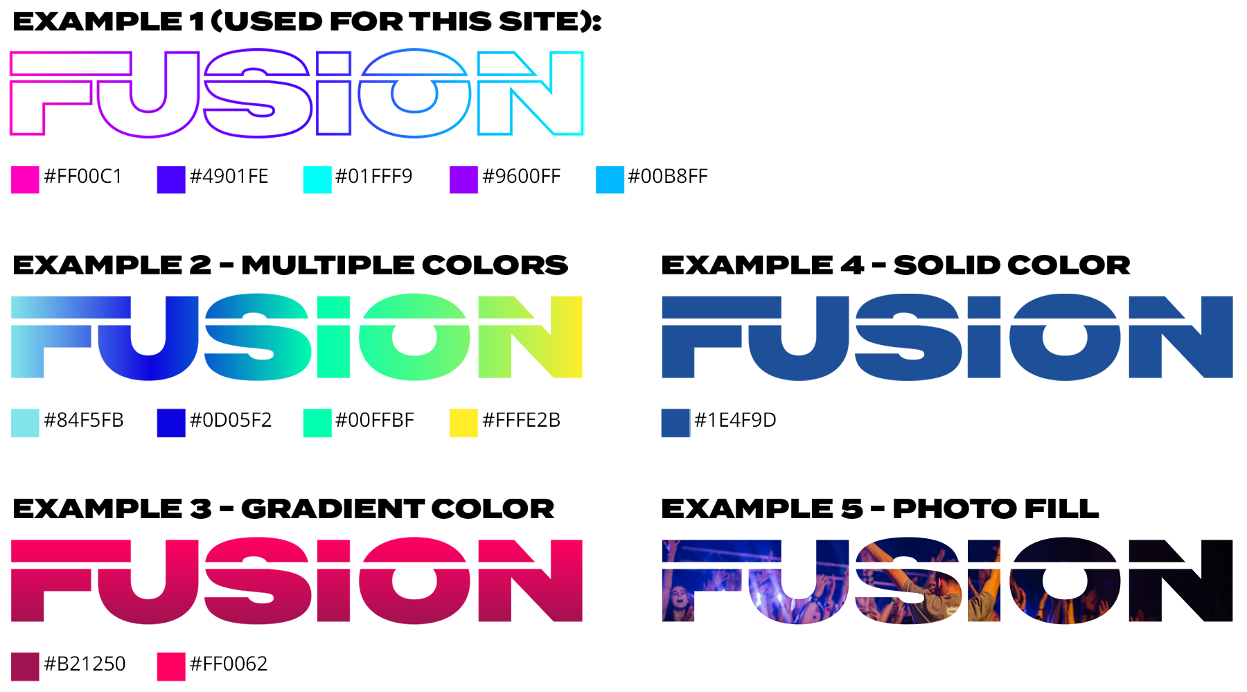
Fusion’s branding strength is in the forms of the logo and other graphics – built in a way to be creatively flexible. A color is a place of creative flexibility for this branding.
The main colors for the Fusion logo are black and white. Other than that, teams can use any set of clean color combinations that add energy and life to the visuals.
We have provided several examples of effective color pallets for designs, the first being used for this branding guideline’s design. We will also provide updated colors each year, based on trends and styles

Go to the "downloads" page to get the Fusion international logos.
The logo files are in .png, .pdf, .ai, and .svg formats.
Note: When downloading white design files, previewing the file may not show up. This only occurs when previewing a white design on a white background. There is nothing incorrect with the file.
*The Icon logo consists of a square with an “F” cutout. This maintains consistency in the icon. Do not create an ”F-only" logo for custom designs and media.



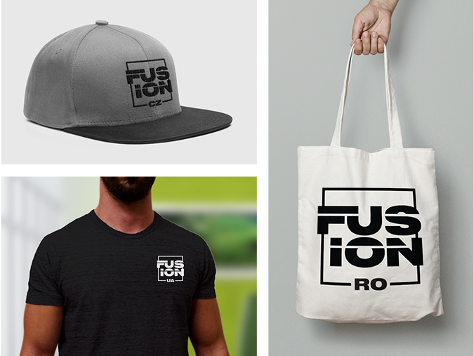
Fusion branding is also used in the country level of ministry. For countries that are leading several local Fusions, there are country-specific logos (“Fusion [country]”). There are three variations of these logos: country logo in English, country logo in the national language, and country logo with the country code.
Do not create custom country-specific logos or icons.
 Go to the downloads page to get your country-specific logos.

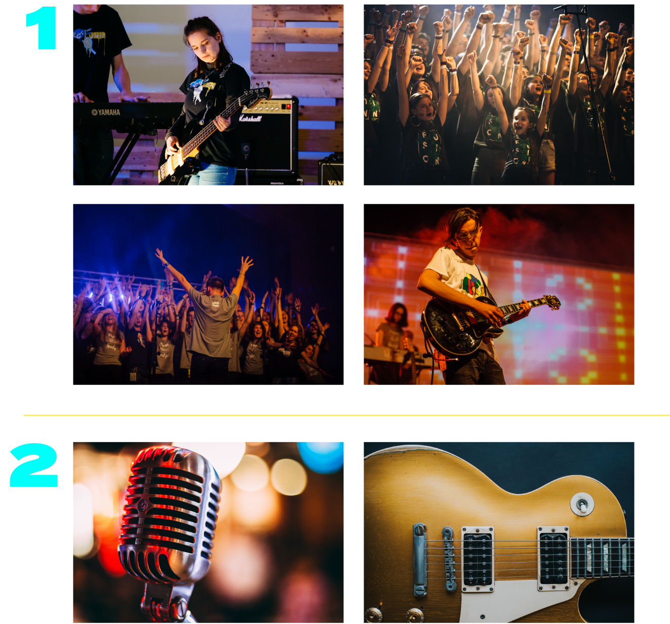
The tone of voice set by Fusion’s photographic communication should be focused on a sense of community, energy, musical performance, and fun.
Primarily, photos should aim to depict groups of people practicing music, performing and singing in groups, and several people having a good time. Photos should always focus on people enjoying music and enjoying fellowship.
Photos of instruments or equipment as the main focus are to be a secondary use, as they do not primarily focus on the community that Fusion is meant to focus on. These photos can be used by local Fusions as a primary photo if group photos are not available.

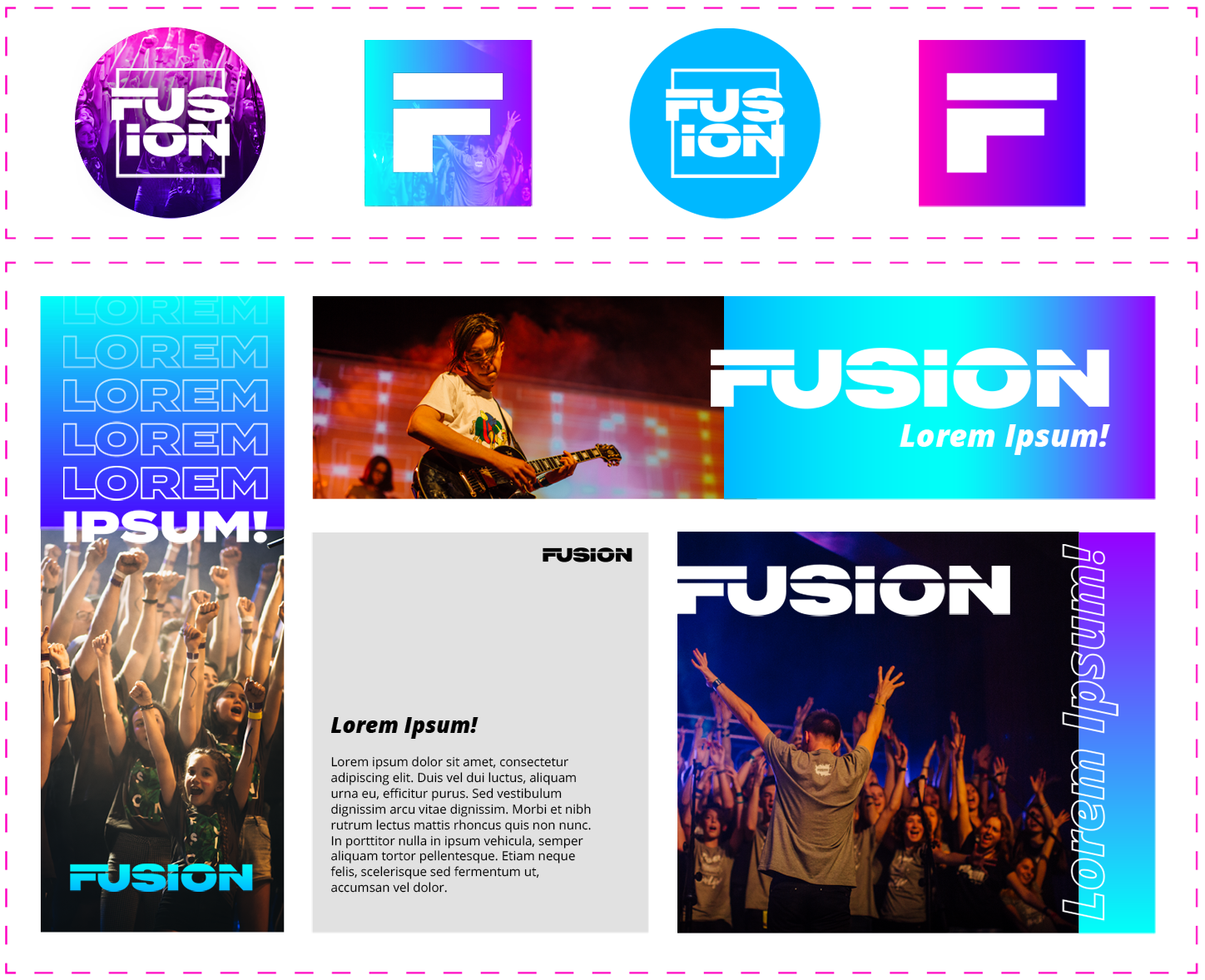
The Fusion international/national/local logo must be the main element in the social media avatar, centered so that it is legible in both a square and circle format. The logo must be in white, and any color used is put in the background of the avatar.
For social media avatars, the stacked logo or the icon logo works best—and fit in the square or circle layouts the best. If using the icon logo, make sure that the word “Fusion” is near the icon in social media, whether in username or description, so that the connection between “F” and “Fusion” is easily understood.
The “F” Icon should only be used when the word “Fusion” is written out next to the icon in the design of the app—for example, an Instagram profile name. Do not use the “F” Icon if the word Fusion is not written near the icon.
For flyers, posters, roll-ups, web banners, and social media posts, a variety of layout formats in different shapes and orientations can be used for communication.
The main focus should be on imagery that encompasses the entire layout with clear and legible heading and logo. The Fusion logo should remain white on any color designs and layouts.
For text-based layouts, the black versions of the logo may be used if the information is in black & white. If there are color and imagery being used in these documents, find ways to use white logos as often as possible.
For web-based communication, avoid using body text if possible or minimize the amount so it can be larger and more legible.

For Fusion merch and gear on the country/international level, the logos should be used as the main design element. For individual local Fusions, logos may be used for secondary or labeling purposes on the merch.
On any merch or gear, the Fusion brand should be present, whether as a label or as the main design. In some cases, the national organization logo should also be present (check with your national organization if you are unsure!).

This page is a group of samples that use the Fusion branding and creatively add color, texture, and energy to the visuals. These are not the limits of Fusion design, rather a starting point for what can be done with Fusion branding. All are usable for the international level as downloadable designs—or can be used as inspiration for country branding or local branding.
All samples are previewed in the main international branding. Downloads will include the main logo, the stacked logo, and the icon logo in the same design.
Click below to download a zip file containing all branding files—logo variations, fonts & colors, and up-to-date samples.
Download All Design FilesClick below to download the international Fusion logos, or to request a custom local Fusion logo.
Download International Fusion LogosRequest Custom Local Fusion Logo
Click your country below to download specific country branding files, including English, the national language, and country code.
Click below to download swatches for Adobe CC or a PDF of color examples to use while designing for Fusion.
Click below to download custom Fusion images for Social Media that handle the brand in an effective way for online profiles.
Download Fusion Social Media GraphicsThis page is a group of samples that take the Fusion branding and creatively add color, texture, and energy to the visuals. These do not show the limits of a Fusion design, rather a starting point for what can be done with Fusion branding. All are usable for the international level as downloadable designs or can be used as inspiration for country branding or local branding.
All samples are previewed in the main international branding. Downloads will include the main logo, the stacked logo, and the icon logo in the same design.
Download Fusion Design Samples


